Design Studio
Learn how to create beautiful coffee packaging with Roastify's easy-to-use design tools
Welcome to the Roastify Design Studio! Whether you're a design pro or have never opened a design tool before, this guide will help you create professional-looking packaging for your coffee products.
New to Roastify? Check out our Create Your First Product guide for a step-by-step walkthrough of the entire product creation process.
For the best design experience, please use a desktop or laptop computer. Mobile devices may have limited functionality.
Getting Started
Guests enter the designer by selecting Start Designing on roastify.app, then choose coffee after the packaging is ready. Signed-in members can also select a product from the Product Catalog and choose Start Designing.
Understanding the Template
The canvas shows your product's template with labeled areas in lighter font:
- Back, Left, Front, and Right - The four sides of the 12oz carton
- Top Flap - The flap that folds over the top; content placed here must be oriented upside down on the flat dieline
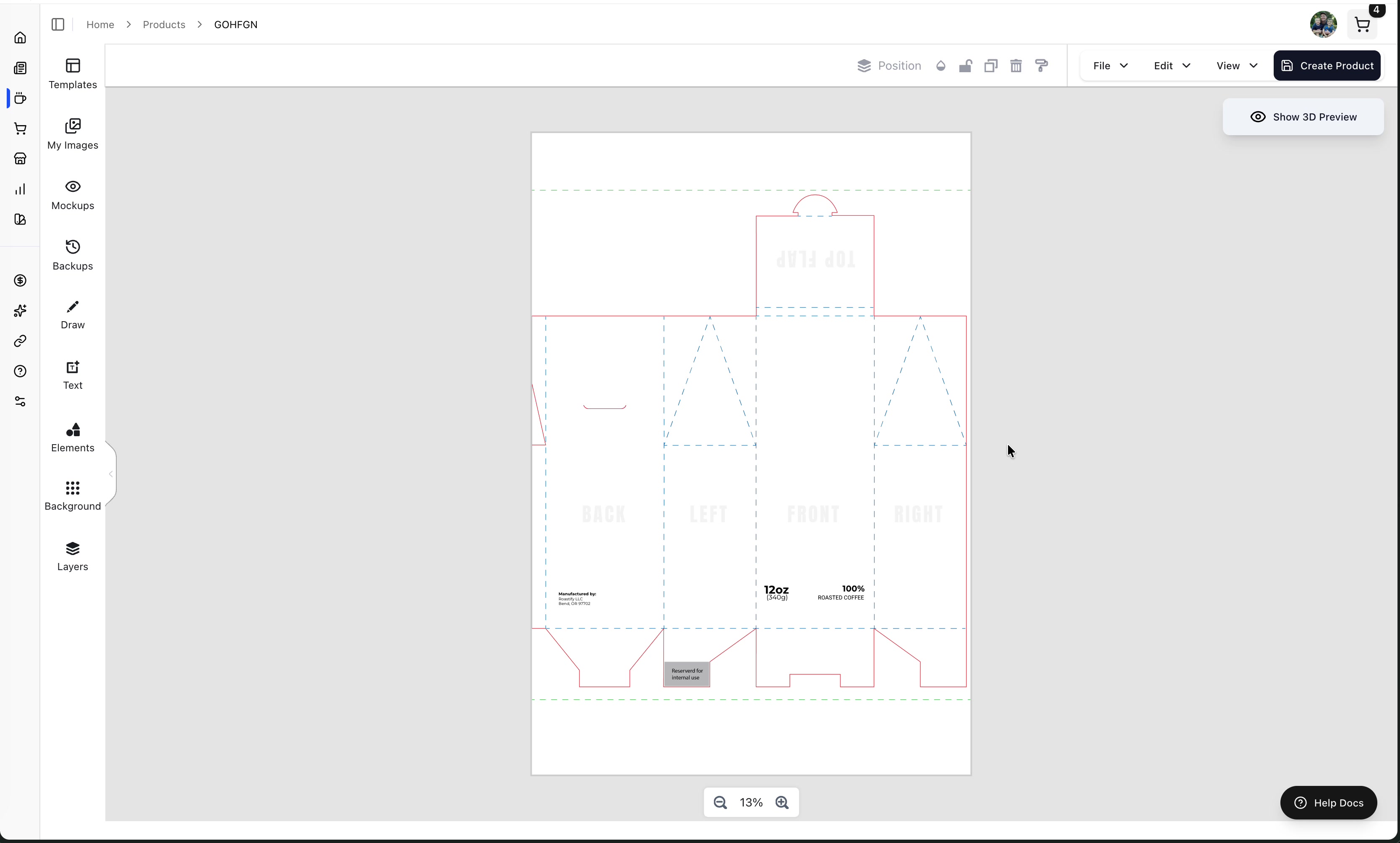
A standard 12oz coffee design must retain three packaging elements: 12 ounces / 340 grams, 100% Roasted Coffee, and Manufactured by Roastify LLC, Bend, OR 97702 or your legal business name and full mailing address.
The Left Sidebar - Design Tools
All your design tools are located in the left sidebar. Let's walk through each tab:
Templates Tab
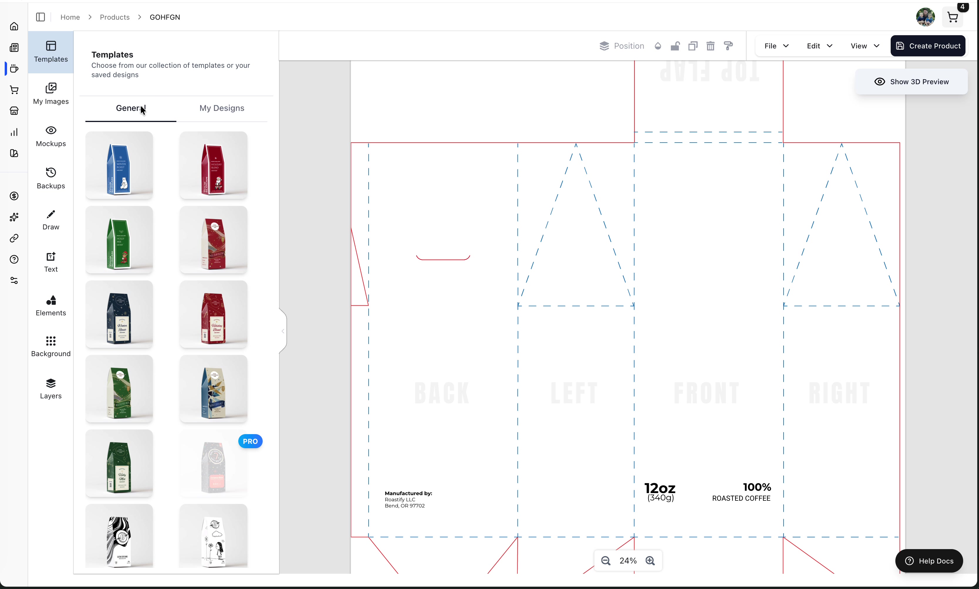
The Templates tab lets you choose a starting point:
Templates - Browse hundreds of pre-made designs, including holiday, business, wedding, outdoor, and other themes, or choose a blank template.
My Designs - Signed-in users can reuse designs previously saved to their account. A guest can add designs to this area by creating a free account after checkout.
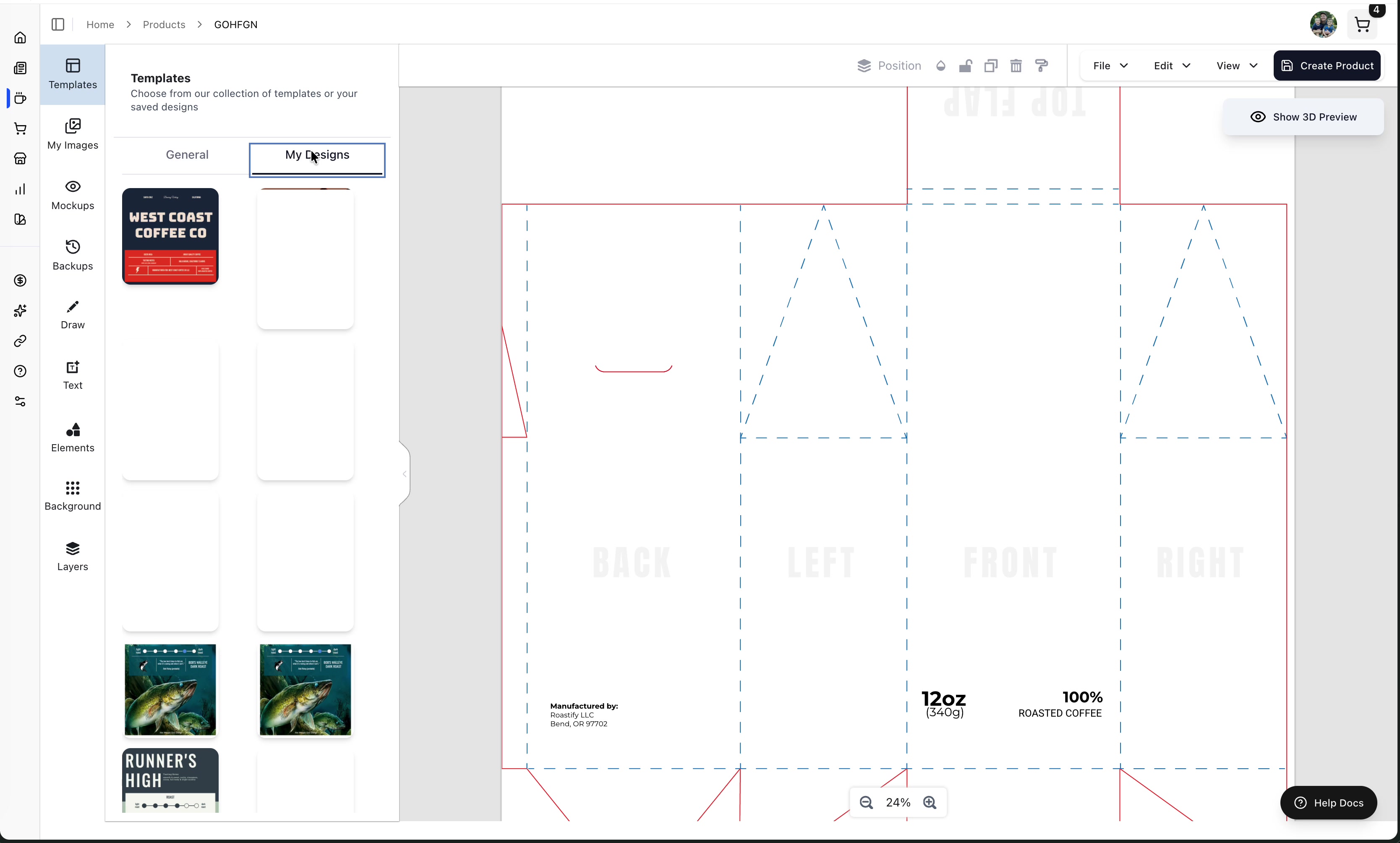
Create a generic template once, then use "My Designs" to quickly apply it to new products with minor adjustments.
My Images Tab
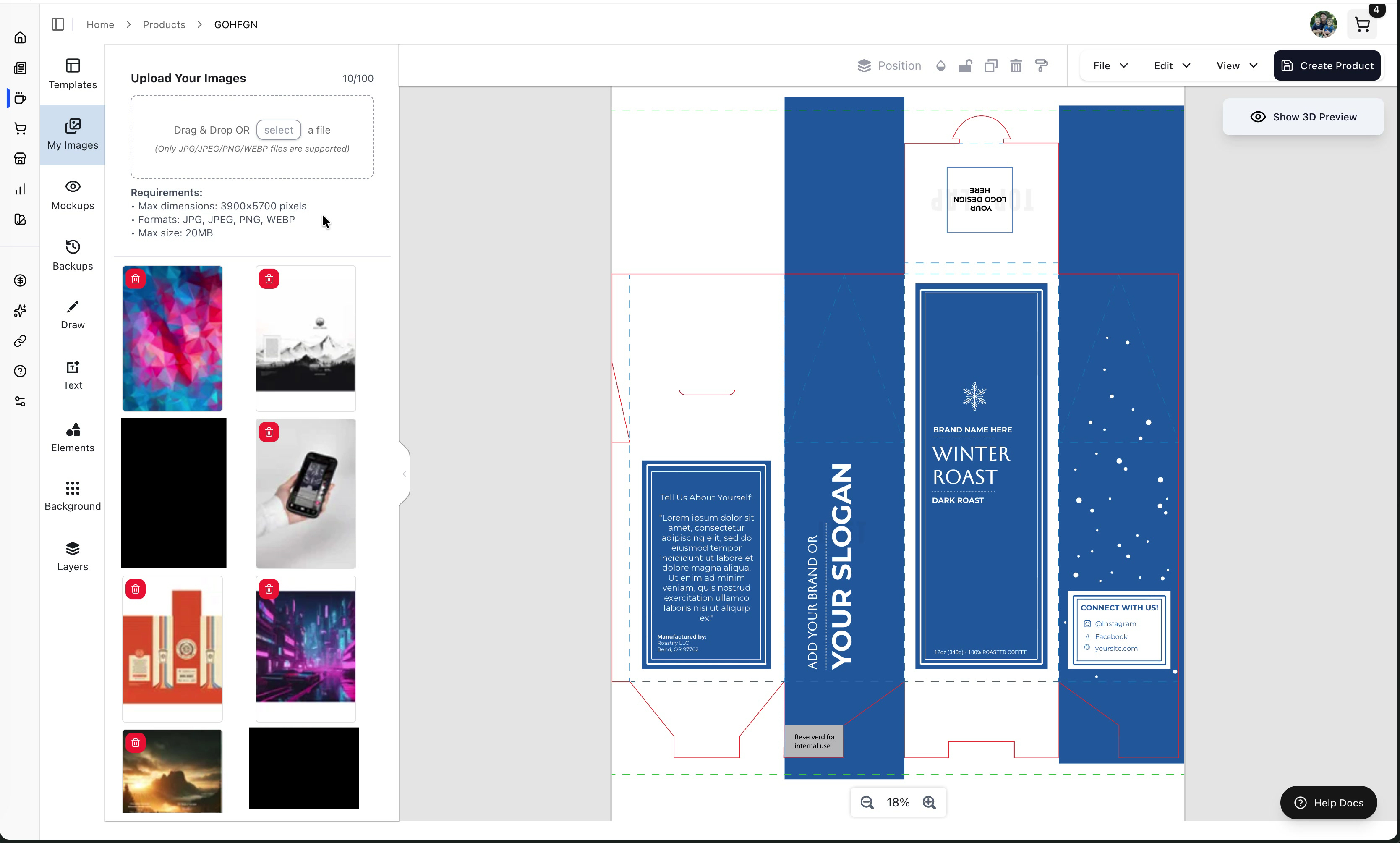
Upload and manage images from your computer:
- Drag and drop files into this area
- Or click to browse your local file system
- Images are saved to your account and available for all future designs
Mockups Tab
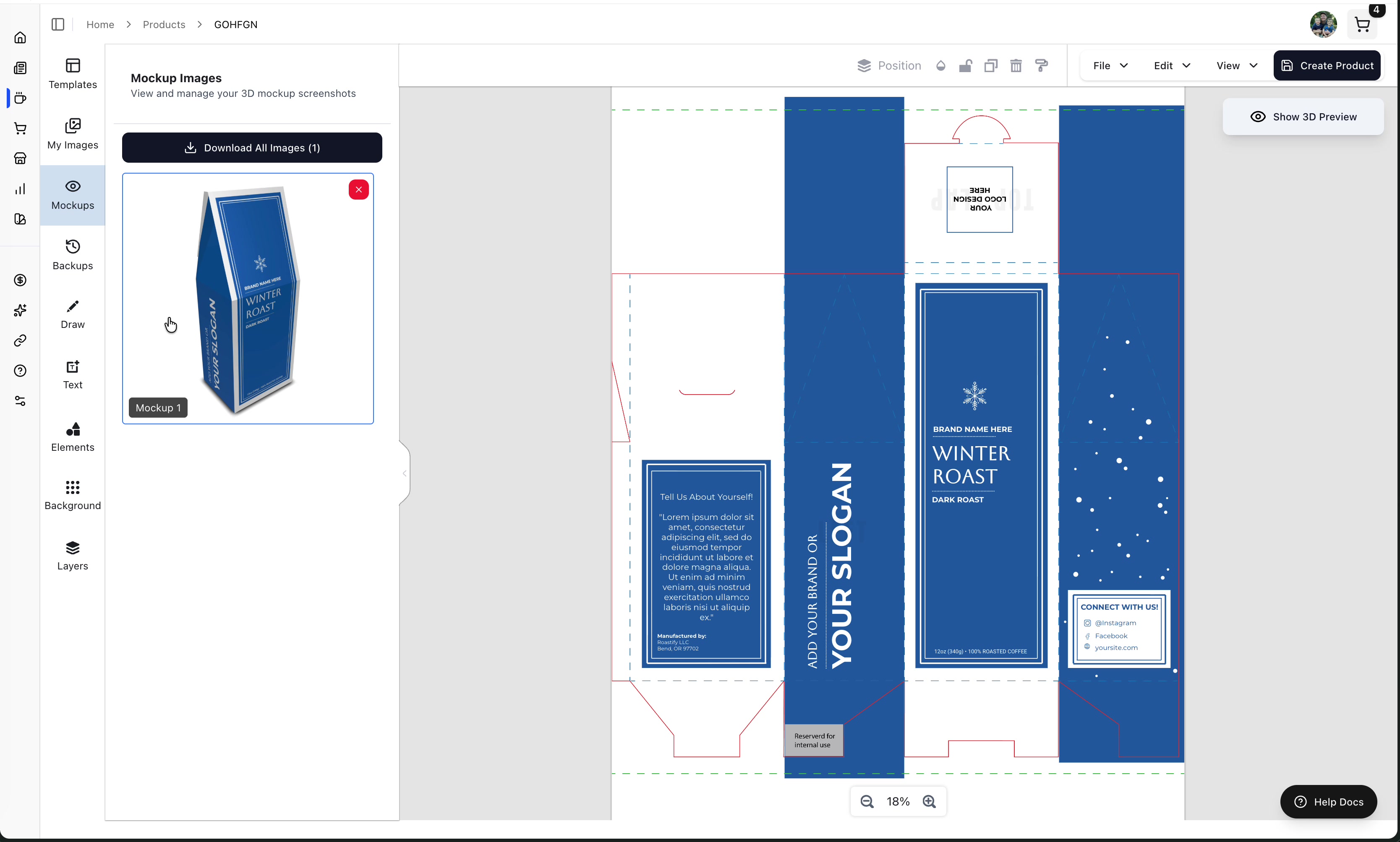
View and download mockup images you've captured from the 3D preview:
- Mockups are saved when you click the Mockup button in the 3D preview
- Download mockups to use in other programs or for marketing
Backups Tab
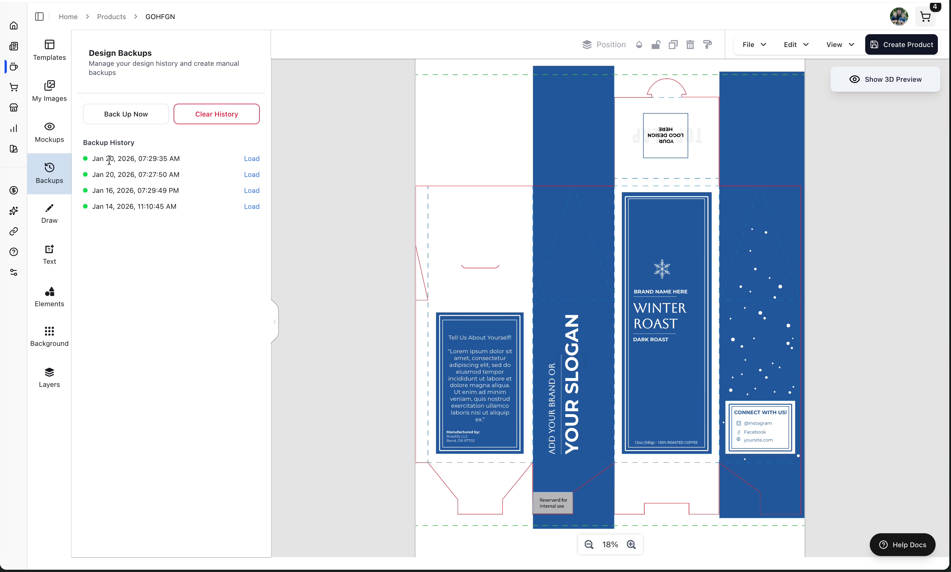
Automatic backups protect your work:
- Automatic backups - Created automatically as you design
- Backup Now - Manually save your current progress
- Load Version - Restore a previous version of your design
Use "Backup Now" before making major changes. If something goes wrong, you can easily restore your previous version.
Draw Tab
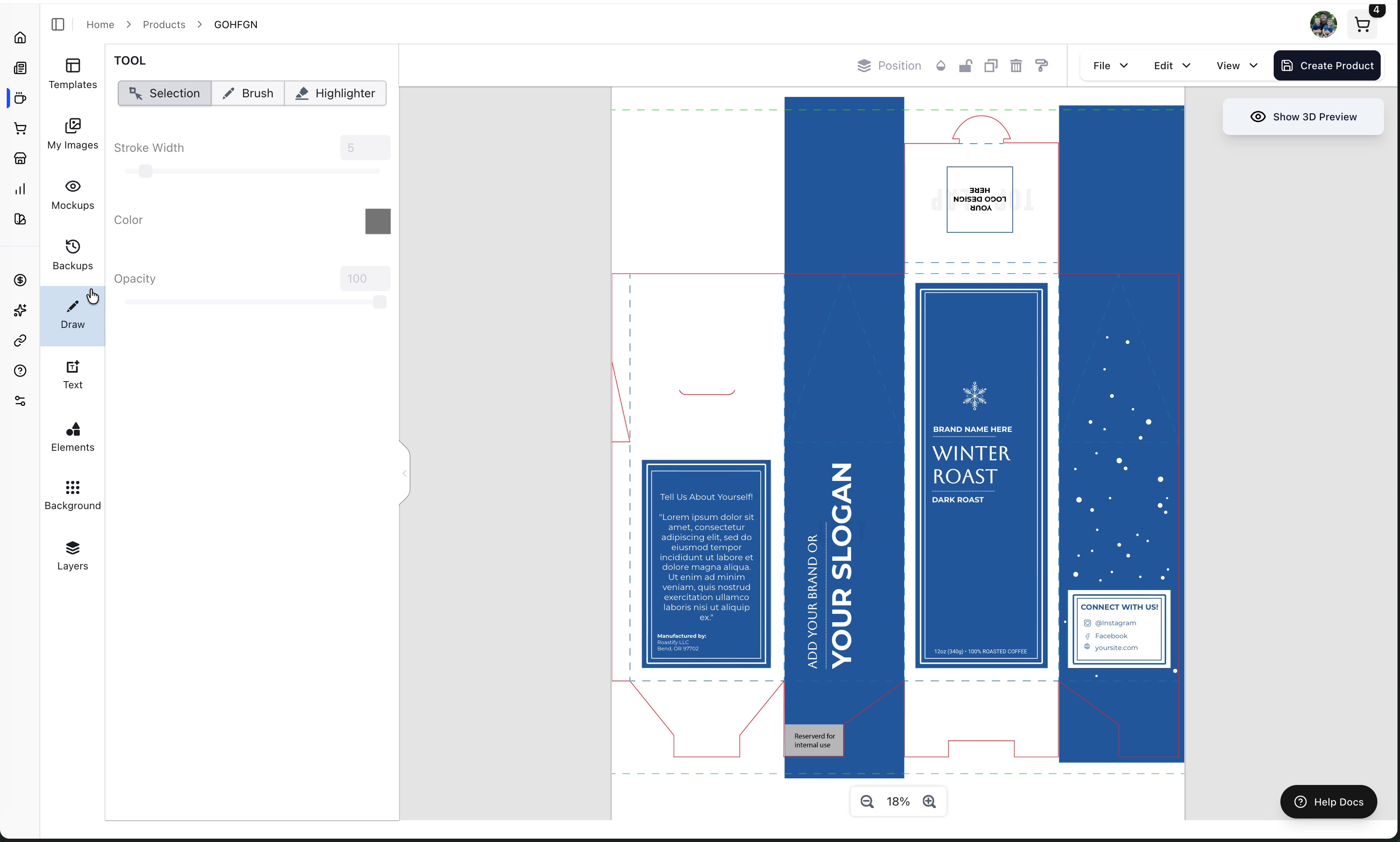
Freehand drawing tools:
- Brush - Draw with your mouse
- Highlighter - Transparent drawing
- Adjust stroke color and opacity
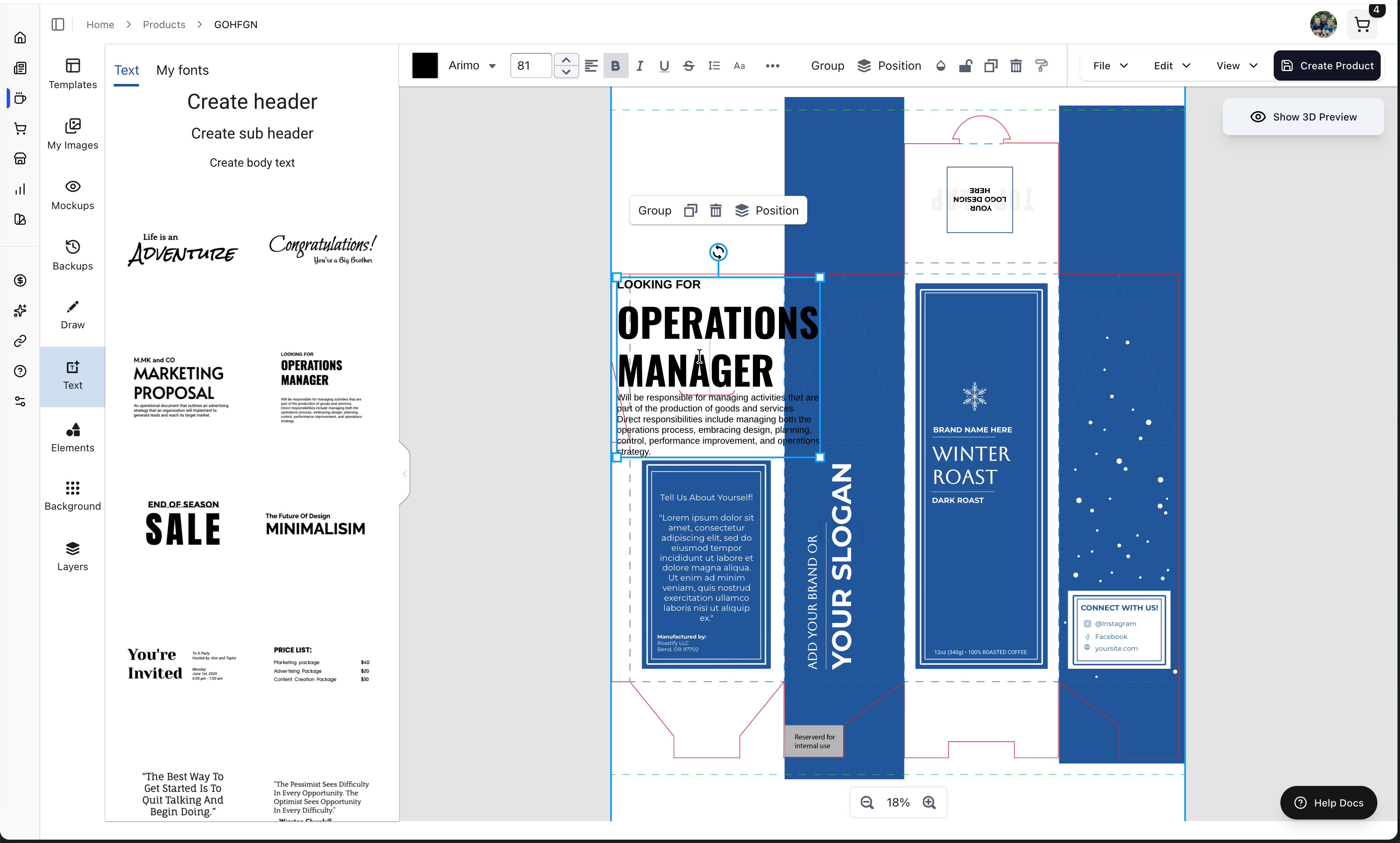
Text Tab
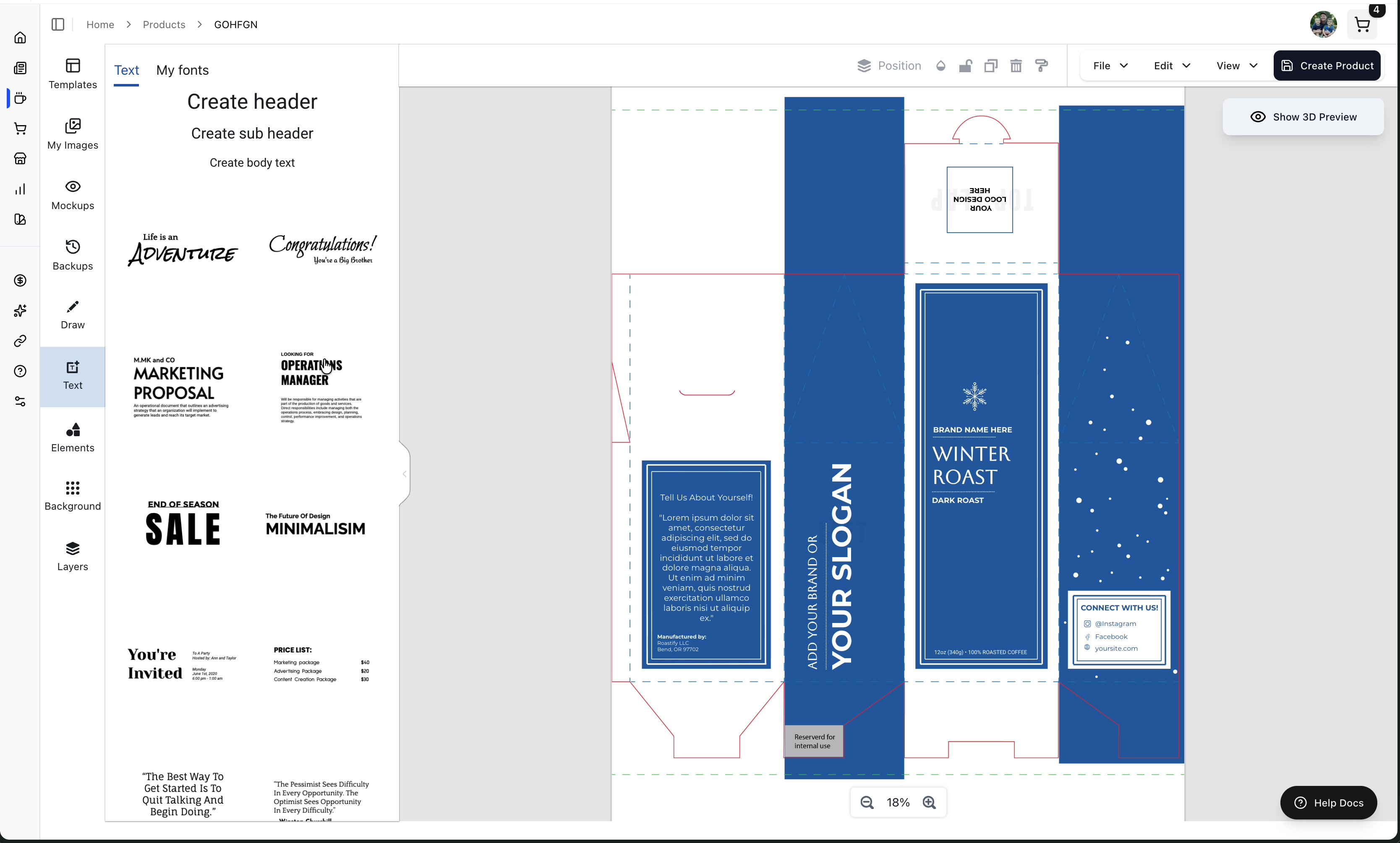
Add text to your design:
Click on a text style in the Text tab
The text appears on your canvas
Double-click the text to edit it
Use the top toolbar to customize (font, size, color, bold, italic, etc.)
Elements Tab
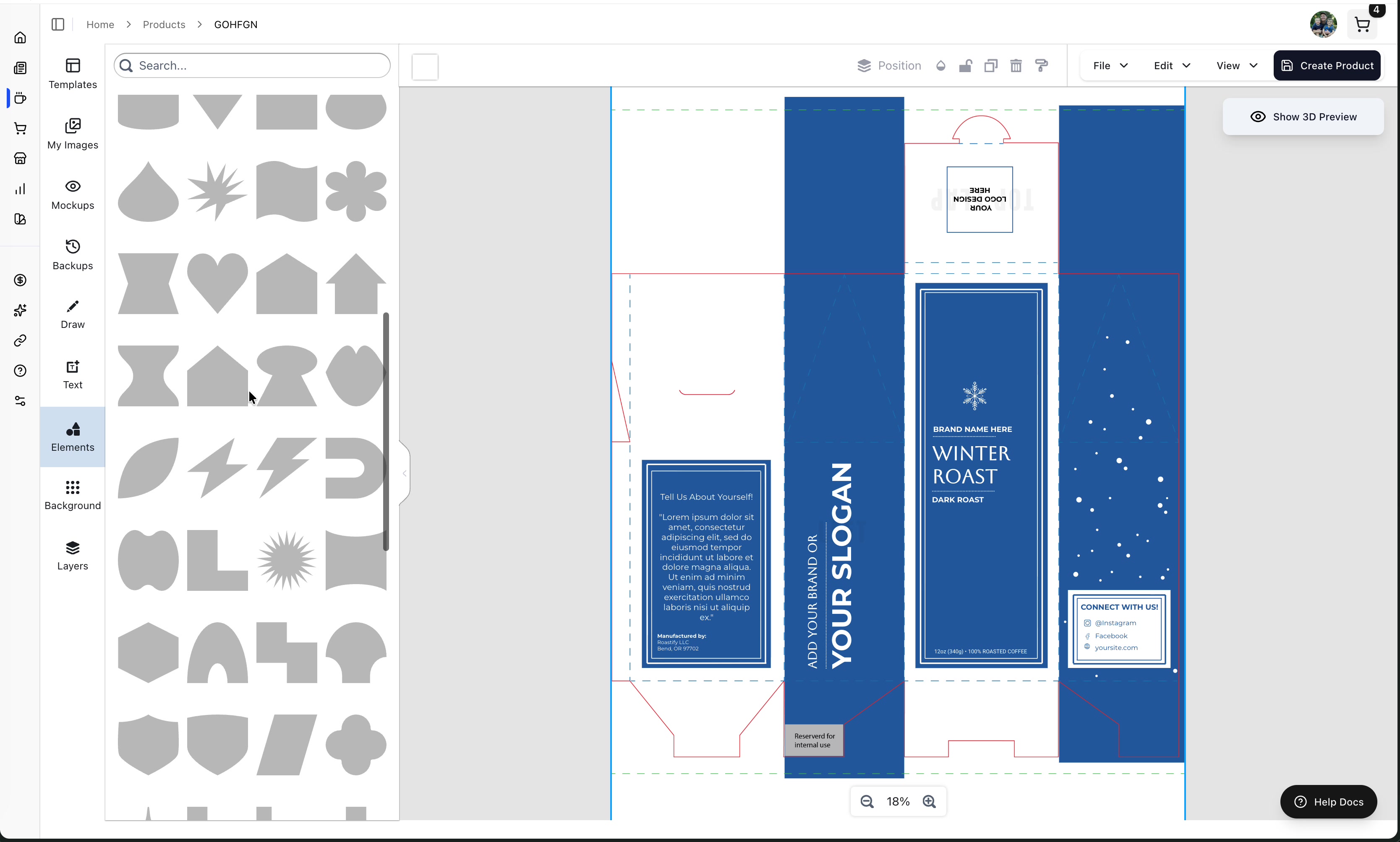
Add shapes and decorative elements:
- Shapes (rectangles, circles, lines)
- Arrows and connectors
- Decorative elements
Background Tab
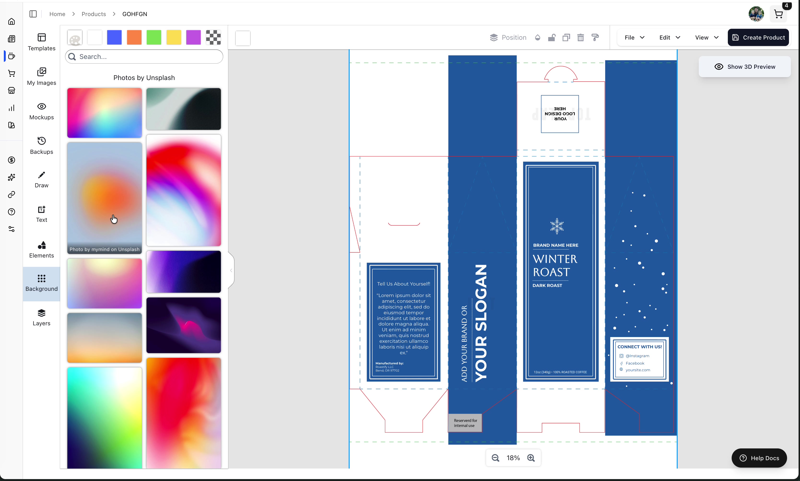
Find backgrounds for your design:
- Gradients - Pre-made gradient backgrounds
- Unsplash Integration - Search for free stock photos
Search Unsplash directly from the designer! Try searching "coffee" to find relevant background images without leaving the app.
Layers Tab
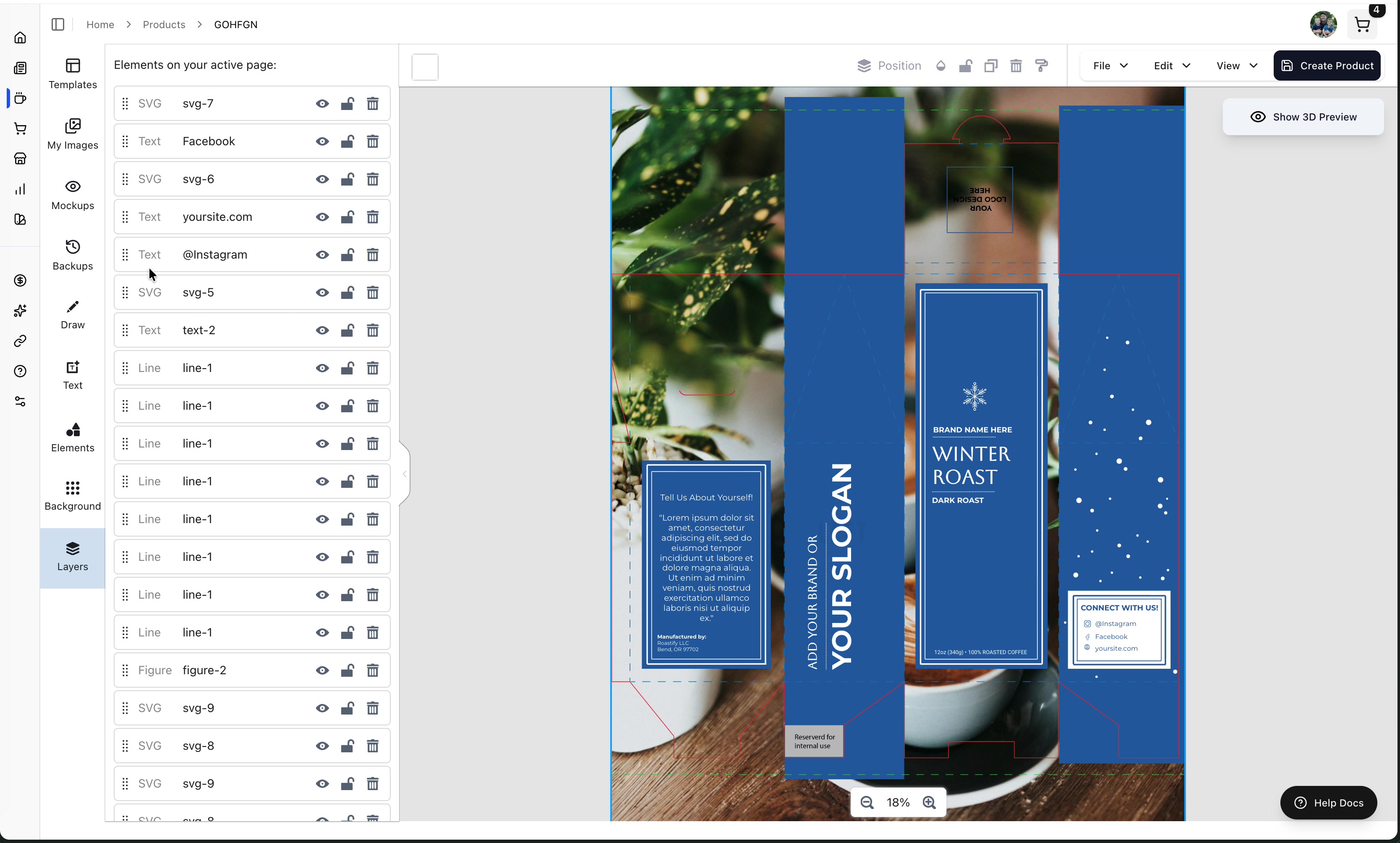
Manage the stacking order of elements:
- Drag layers - Reorder which elements appear on top
- Eye icon - Toggle visibility on/off
- Lock icon - Lock elements so they can't be accidentally moved
Lock your background layer to prevent accidentally dragging it while working on other elements.
The Top Toolbar
When you select an element, the top toolbar shows element-specific options:
For Text Elements:
- Font family and size
- Bold, italic, underline, strikethrough
- Text color
- Effects (blur, shadow, background)
For All Elements:
- Position and alignment
- Opacity
- Effects and filters
3D Preview
See your design as it will look on the finished package. In the guest designer, the 3D box in the upper-right updates as you edit. In the signed-in product designer, use Show 3D Preview when you want to refresh and inspect the model.
Click Show 3D Preview button
A 3D preview window opens
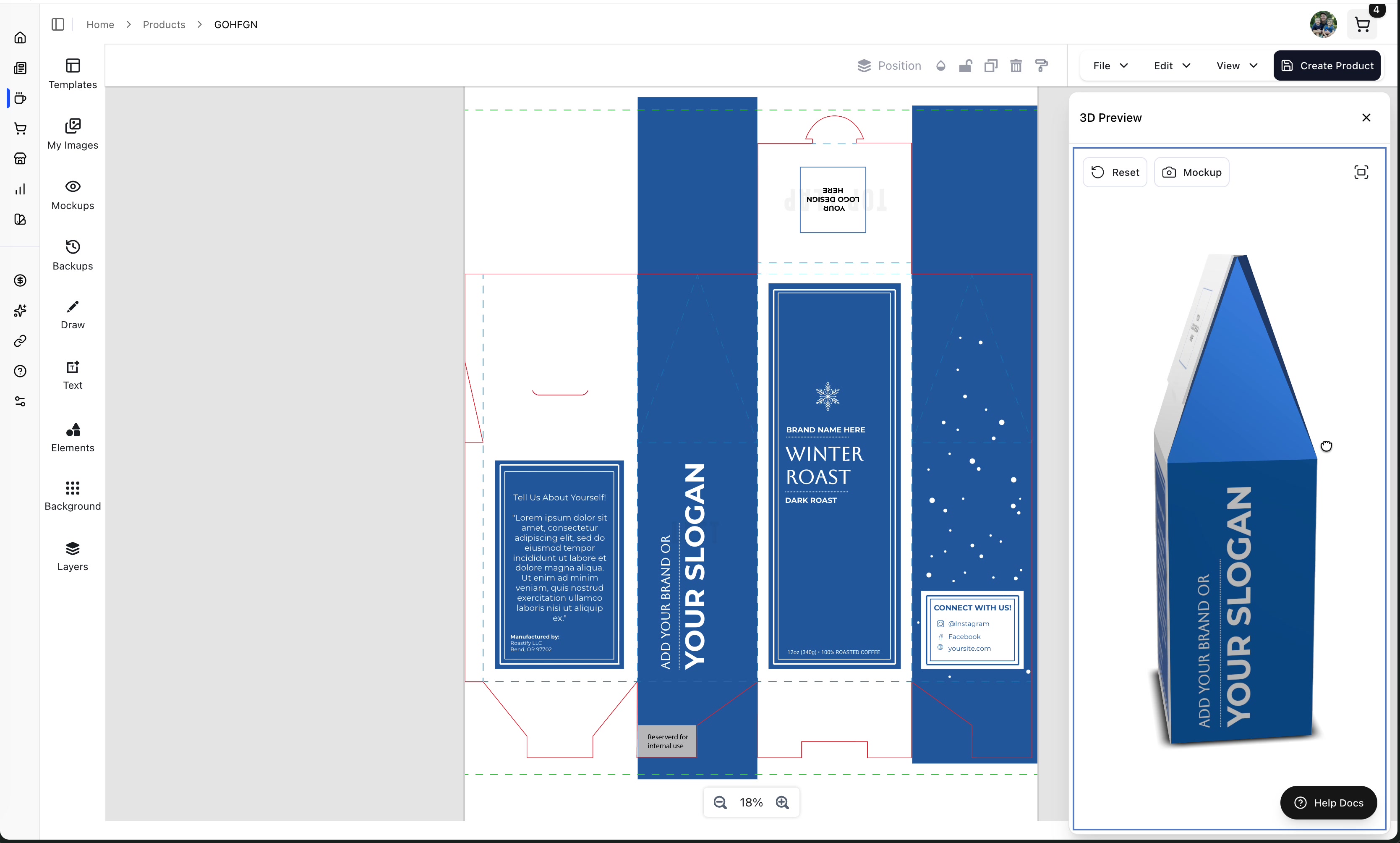
Use your mouse to rotate and view from any angle
3D Preview Controls
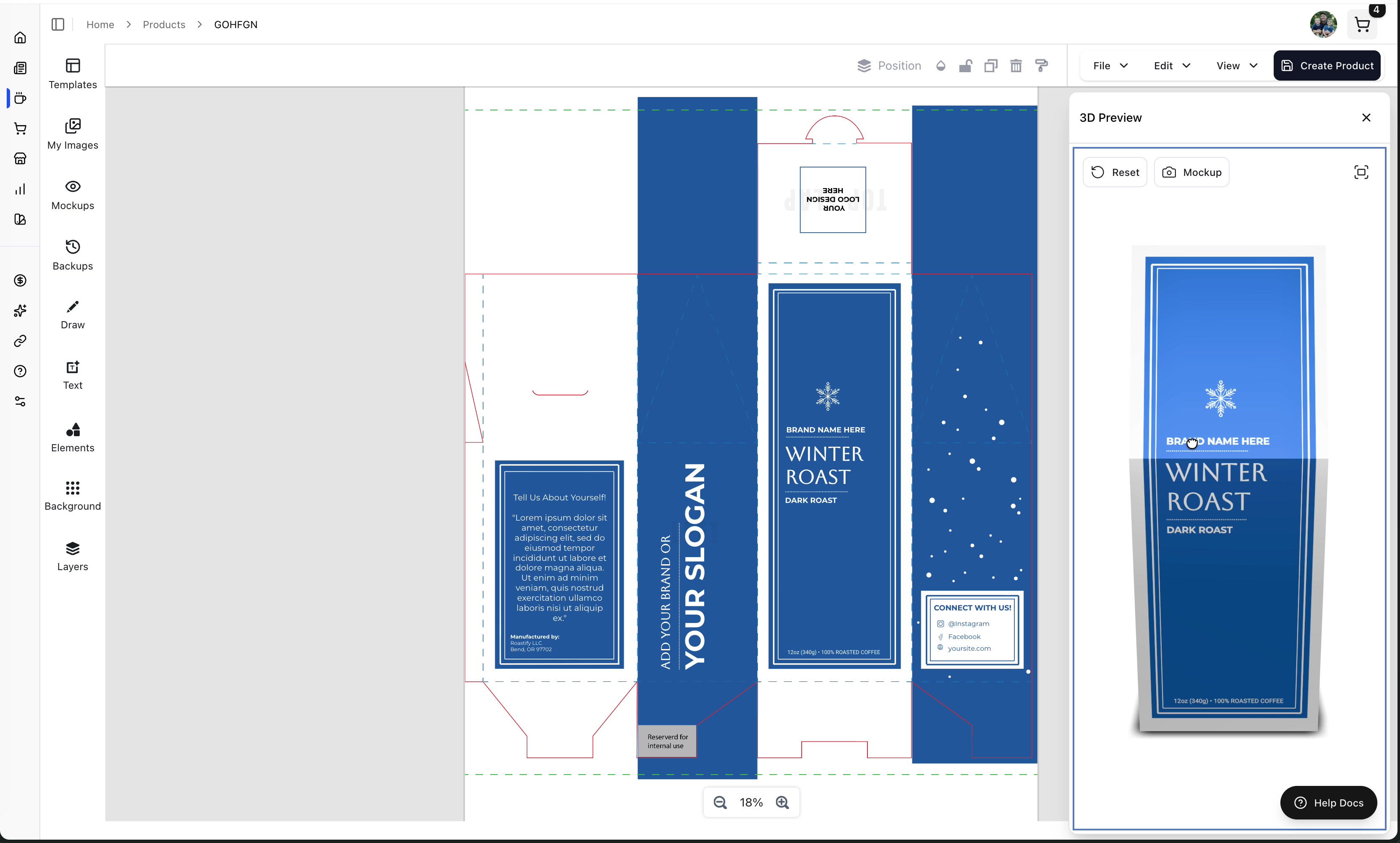
| Button | Function |
|---|---|
| Reset | Returns the view to the front of the product |
| Mockup | Captures the current view and saves it to your Mockups tab |
| Fullscreen | Expands the 3D preview to full screen |
Rotate the 3D box and inspect the front, back, both sides, and top flap before continuing. A correct flat design can still reveal alignment or orientation problems after it wraps around the model.
Saving Your Work
Guest Designs
Select Next after the packaging checks pass, choose coffee and quantity, and complete checkout. The confirmation screen offers a free account so you can claim the designs from that order. The account has no monthly fee; without Base or Pro, future orders continue to use non-member pricing.
Automatic Backups
The Design Studio automatically creates backups as you work. You can access these from the Backups tab in the left sidebar.
Manual Backups
Click Backup Now in the Backups tab to manually save your current state.
Exporting Your Design
Go to File in the top toolbar:
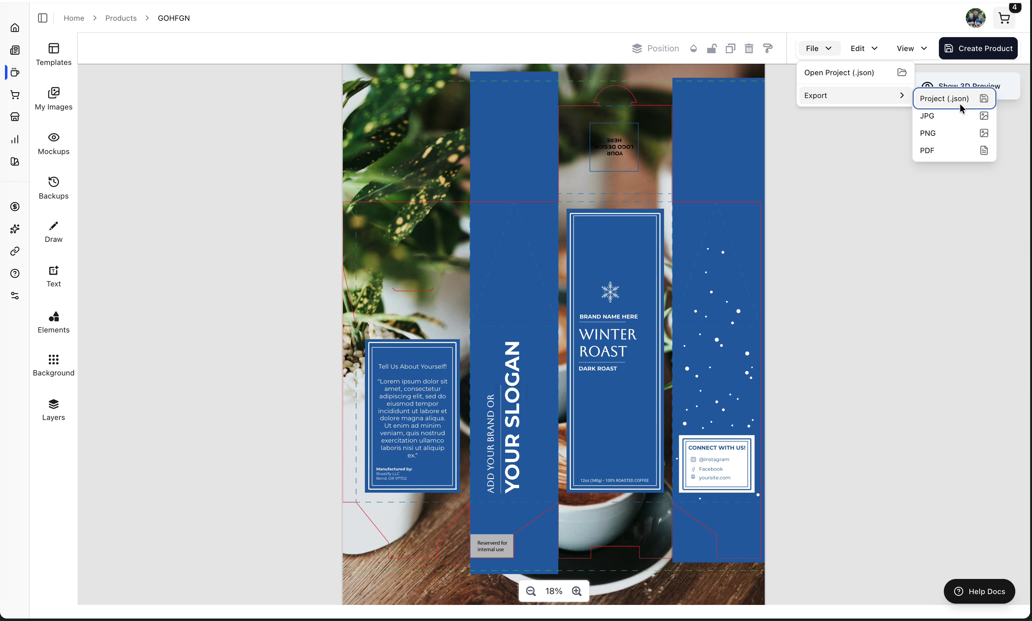
- Export as JSON - Save a backup file to your computer
- Save Images - Download the 2D canvas design as an image
Creating Your Product
When you're happy with your design:
Click Create Product in the top right corner
Enter your Product Name (required)
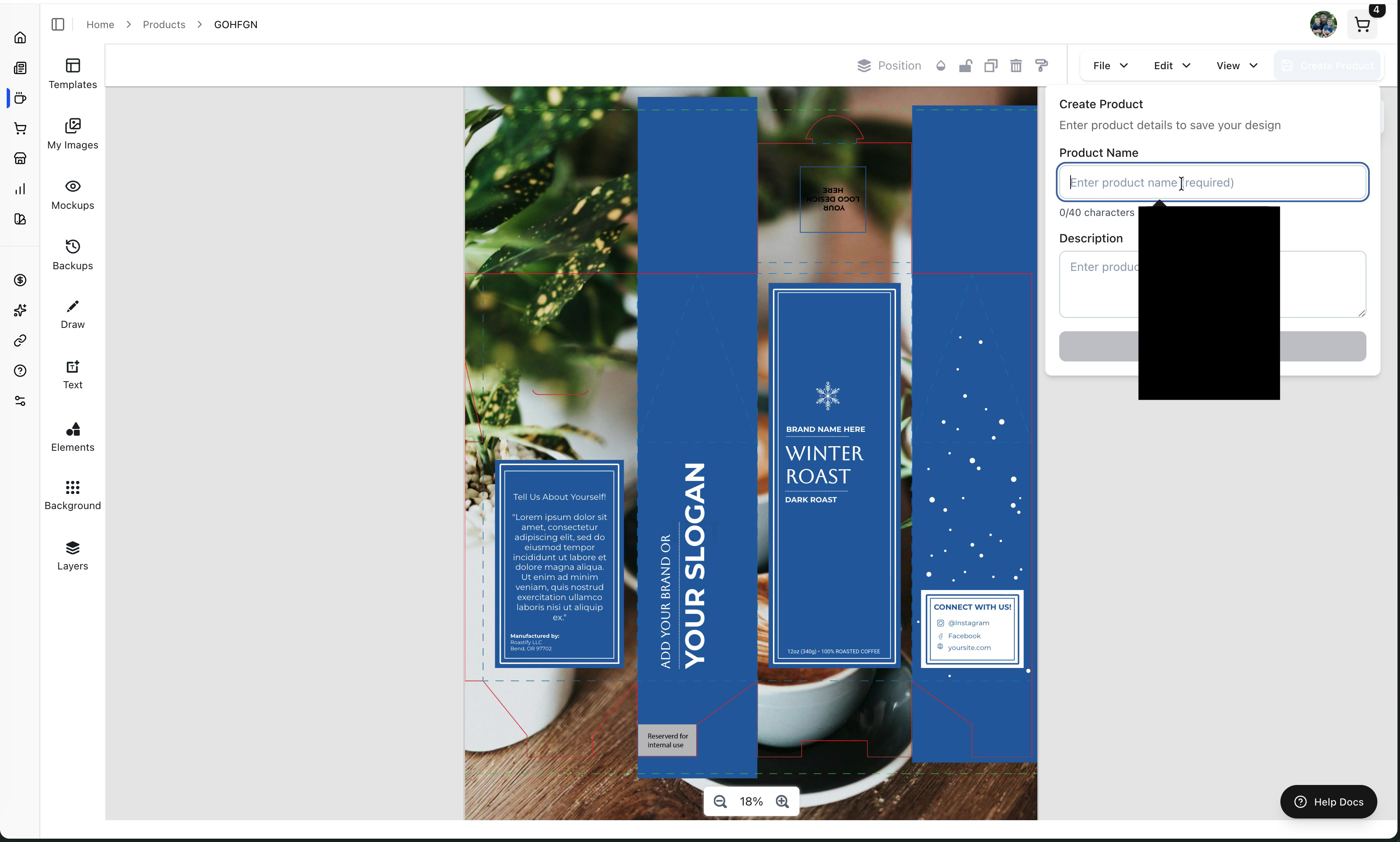
Add an optional Description
Click Create Product
Wait for the design to upload (this may take a few minutes for large designs)
Your product is now added to the My Products page!
Design files are large and may take a few minutes to save and upload. Don't close the browser until you see the success confirmation.
Design Best Practices
Keep It Simple
-
✅ Use clean, readable fonts
-
✅ Limit your color palette to 2-3 colors
-
✅ Make your brand name the most prominent element
-
✅ Include essential information (coffee type, weight, your brand)
-
❌ Use too many fonts or colors
-
❌ Clutter the design with too many elements
-
❌ Use low-resolution images
-
❌ Put important text near edges where it might get cut off
Make It Professional
- Brand Consistency: Use the same fonts and colors across all your products
- High Quality Images: Use clear, professional photos
- Adequate Contrast: Make sure text is readable against the background
- White Space: Don't be afraid of empty space - it helps your design breathe
Required Information
Your standard 12oz coffee design must include these packaging-compliance elements:
Mandatory Text:
- Product weight: "12 ounces / 340 grams" in both imperial and metric units
- "100% Roasted Coffee"
- "Manufactured by Roastify LLC, Bend, OR 97702" or your legal business name and full mailing address
Required placeholders cannot be removed. Keep each one visible and legible; the design cannot be saved for ordering if a required element is missing or invalid.
Image Requirements (For Uploads)
If you're uploading your own design instead of using the in-app designer:
| Requirement | Specification |
|---|---|
| Resolution | 3900 x 5700 pixels |
| DPI | 300 DPI |
| Format | JPG or JPEG |
| File Size | 10MB or less |
Dieline Templates
We provide dieline templates for advanced design in external tools like Photoshop or Illustrator:
Keyboard Shortcuts
| Shortcut | Action |
|---|---|
| Ctrl/Cmd + Z | Undo |
| Ctrl/Cmd + Y or Ctrl/Cmd + Shift + Z | Redo |
| Arrow Keys | Nudge selected element |
| Shift + Drag | Maintain aspect ratio while resizing |
| Delete/Backspace | Remove selected element |
Troubleshooting
"My image looks blurry"
- Make sure you're uploading high-resolution images (at least 1000x1000 pixels)
- Check the original file quality
- Vector images (SVG, AI) work best for logos
"Colors don't match what I expected"
- Computer screens display colors differently than print
- The preview is an approximation
- Use the color picker to adjust until you're happy
"Text is hard to read"
- Increase font size
- Add contrast between text and background
- Use simpler fonts for small text
"The 3D preview looks different from my canvas"
- The 3D preview wraps the design onto the product shape
- Some distortion is normal for curved surfaces
- The flat canvas view is most accurate for design work
"My design isn't saving"
- Wait for the upload to complete (large designs take time)
- Check your internet connection
- Try clicking "Backup Now" to save locally first
Getting Help
Email Support
Questions about the designer or your designs? We're here to help.
Professional Design Services
Want a professional design but don't want to do it yourself? Learn about our services.